RAYDIANT - MESSAGING V2
An upgrade to Raydiant's existing messaging feature within its employee experience platform.
DESCRIPTION
Messaging V2 is an expansion of Raydiant's existing messaging feature that currently lives within its employee experience platform.
TIME FRAME
June 2022 - July 2022
TEAM MEMBERS
John Kwan (Product Designer)
Cathleen Candia (Senior Product Manager)
TOOLS USED
Adobe XD
SUMMARY
One of Raydiant's product offering is an employee engagement platform called Hoopla. It is an enterprise software that fosters friendly employee competition, and helps to streamline communications between the back-office and brick-and-mortar employees.
With Messaging V2, it aims to enhance the existing messaging app by allowing regular users to engage with messages through likes and comments. Furthermore, users will also be allowed to delete messages with this new update.

MY ROLE
This was a project that was assigned solely to me even though I was part of a small design team.
Therefore, I was responsible for all design activities from research, conceptualizing, wireframing, prototyping and creating hi-fi mockups.
Given the limited time constraint, I decided to reduce the time spent on research, and placed more emphasis on validating our solutions through user testing instead.
QUESTIONS HERE, QUESTIONS THERE
At a first glance, the project seemed fairly straight forward, but there were actually a lot of nuances to figure out.
For example:
- What are all the roles available and their granted permissions?
- Does deleting permanently remove a message or simply hide it for yourself only?
- Are like/comment permissions handled on an individual post basis or toggled through a global permission setting?
- How technically feasible are the proposed solutions?
- Would users be able to interact with other emojis other than "like"?
- If so, would they stack or override each other?
- What emojis should there be and how many?
- Would these options be shown in the collapsed or expanded state of a message post?
- How would the interaction of expanding comments work exactly?
For questions like 1-4, I had quickly set up a meeting with the Product Manager to get clarification as it pertained to project requirements.For questions like 5-9, I strived to find the answers through a combination of research and user testing.

DOMAIN RESEARCH
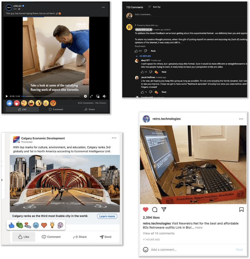
For research, I looked into platforms such as Facebook, Instagram, linkedIn, and YouTube. This helped me get a better understanding of:
- How the like and comment buttons are displayed
- How the comment expand/collapse interactions worked
- The pros and cons of each approach and the rationale behind it
Through this, it gave me plenty of ideas when it came to conceptualization.

EXPLORING DIFFERENT CONCEPTS
After some research and a better understanding of project requirements, I started exploring different ideas on how the current message feed can function with the new features implemented.
During my conceptualization phase, I explored:
- Different ways the reaction and comment buttons can be displayed
- Different versions where comments are either hidden at first or previewed
- Different ways a post can be expanded and collapsed
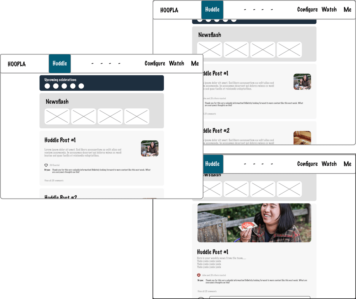
After weighing the pros and cons of each idea, I eventually narrowed down the most plausible ones to version A (left image) and version B (right image).

PROTOTYPING AND USER TESTING
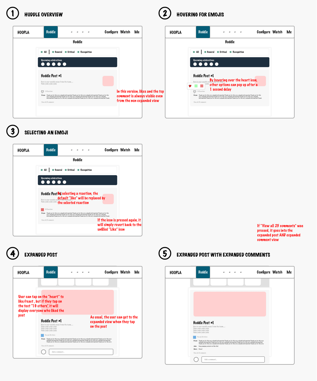
With versions A and B decided, I prototyped them and invited 8 people for user testing to determine which version was the most intuitive to use.
The following simple tasks were given with minimal guidance and users were asked to speak out their thought process while completing it:
- "Go ahead and like the post"
- "Try to see what other people's reactions are"
- "Go back and change your reaction to sad"
- "Show me how you would go about reading other people's comments"
- "Go ahead and try to collapse the post" (They actually can't, it's a curveball thrown at them)
As these tasks were carried out, we observed for the following:- Will the user know how to "expand" the post first, before being able to press "like"?
- Will the user have trouble finding what to click? If so, is there a tendency to click on the icon or text first?
- Will they "unlike" first before changing reaction? Or go straight to "sad"?
- Will they click on the big comment button or the little "# comments" above it instead?
- What is their natural inclination for collapsing a post?

VERSION A
General Feedback:
-"Like" button doesn't really clutter screen, would prefer having it from the get-go
-No problem discovering other's reactions
-No problem recognizing the big comment button and small comment text react the same way
-Would prefer content to expand on same page rather than a pop-up because they are shorter in length

VERSION B
General Feedback:
-The option to react with other emotions other than "like" was not as obvious
-The terminology "like" is slightly confusing now that a happy face and heart is both available as options
-Would like the ability to collapse posts, otherwise it could get annoying with lots of posts

SO WHAT WAS THE TAKEAWAY?
Based on the positive feedback for version A, I decided to proceed with it while applying what I learned through the constructive feedback from both versions.
Unfortunately at this point, I was not able to continue working on this project as I was part of a company wide layoff.
RETROSPECTIVE
Although I was not able to continue with this project in the end, I was still very proud of the amount of work that I've put in to it.
I still felt that this was a project that was worth writing a case study for to highlight my thought process for UX/UI design.
If I had the chance to restart the project from start to finish, I would :- Pro-actively set up meetings with the sales team for research purposes and better understand user pain points
- Conduct user testing for other features such as deleting a post
- Have spent even more time on ideating features outside of likes and comments (e.g: Deleting post)
- Set up a weekly check-in meeting with the Product Manager and Senior UX/UI Designer to make sure that requirements were being met.
Nonetheless, I’m very proud of what I've been able to learn during this short time.


