CALMVERSATION
Responsive web design for an innovative educational tool for teachers
DESCRIPTION
Mobile App for creating and consuming bite sized e-learning content on-the-go.
TIME FRAME
Nov 2018 - Dec 2018
TEAM MEMBERS
John Kwan (UX Designer)
Winnie Dai (UX Designer)
Jocelyn Cho (UX Designer)
Timothy Chan (UI Designer)
TOOLS USED
Sketch
InVision
WHAT IS CALMVERSATION?
Our client Missy Jena sold a product which is an innovative curriculum that could be purchased on calmversation.org for educators teaching grades K-12.
Unlike traditional education, calmversation aims to foster knowledge by encouraging students to express themselves freely in a fun and engaging environment.
The course package is available to be purchased at the classroom, school and district level at a monthly rate.
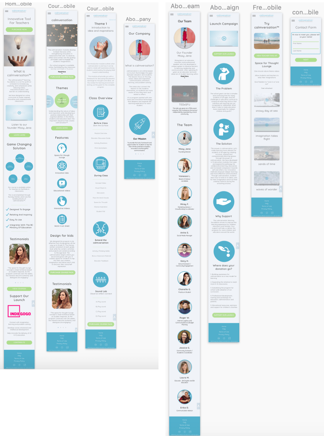
FINAL DESIGN PREVIEW


UNDERSTANDING THE PROBLEM
According to Missy Jena, site analytics show that the majority of the users would spend a long duration on the site but don't end up purchasing the product.
We believe that this is due to navigation frustrations and a difficulty in understanding what the business is trying to sell, as the website was very text heavy and contained a lot of redundant information.
Therefore, we want to validate this problem through research and also discover how we can solve it with our designs.


MY CONTRIBUTION
I was part of a team of 4 composed of 3 UX designers (including myself) and 1 UI designer.
Amongst the UX team, deliverables were equally shared by each member throughout the design process including research, ideation, planning, wireframing, prototyping and user testing.
Once mid-fidelity designs were completed, they were passed on to our UI designer who would put the finishing touches to our screens.
DOMAIN RESEARCH
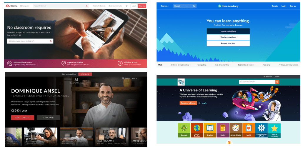
We wanted to start our research by taking a look at other similar services in the market to get an idea of how they structured their website in terms of layout and content. Some platforms we looked at are Udemy, Khan Academy, MasterClass, and BrainPOP.
We found out that most of the online learning platforms out there have a common theme of testimonials being displayed on the homepage, and there were a lot of visuals that accompanied the texts.
However, most online learning platforms catered to individuals as opposed to calmversation’s class-wide approach.

SURVEYS & INTERVIEWS
In total we conducted 6 interviews and had 28 survey respondents.
We found the following:
Top 3 factors people consider in an online platform are Price, Course Description, and Sample/Demo Lesson
Users disliked how the website was too heavy on text
Visuals are much more preferred to texts for quicker skimming
What this meant for us from a design perspective:
- Users shouldn't have to jump through pages to read the course description.
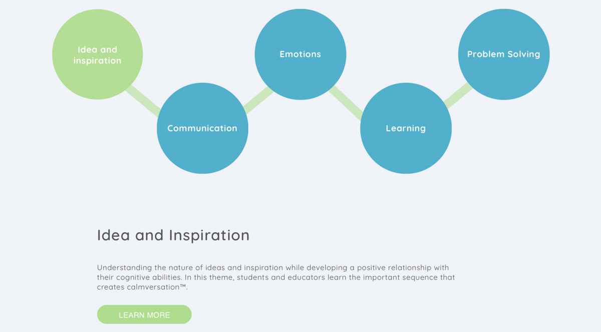
- Add a course overview section on the homepage and an interactive graphic on the courses page where users can hover over different ‘circles’ to read about the different 'themes' of a course without opening multiple new tabs.


AFFINITY DIAGRAM
After getting back data from our research, we wanted to organize it and see if we could observe any patterns. Therefore, we used a created an affinity diagram and grouped our data into these categories:
- Demographics,
- About calmversation
- User Motivations
- Online Learning & Website
- User Frustrations.
Some patterns found were:
Most respondents were either teachers or students who care about the education system with a strongest interest in online learning
Frustrated with how the website is too vague and ambigious with too much reading and not enough specific mentions of results and benefits
Images/videos would be a preferred communication method
Most people disliked how the current education system is too theoretical with not enough focus on the social aspect


CONTENT AUDIT
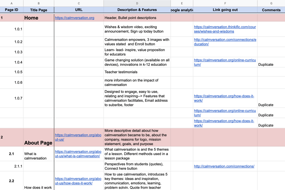
First we conducted a Content Audit to analyze the current structure of the website. We ID’d every single page and section of the website, wrote a brief description of it, and also documented any outgoing links.
At the end of the exercise, by looking at duplicate outgoing links and similar descriptions, we were able to identify pages and sections that we deemed as redundant and eliminated them.
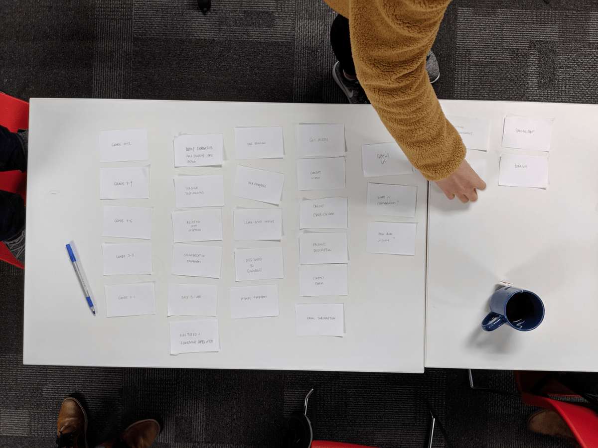
OPEN CARD SORTING
We also did Open Card Sorting with several participants where we labelled each page and section of the old website into cards and asked participants to rearrange them in a structure that made sense to them.

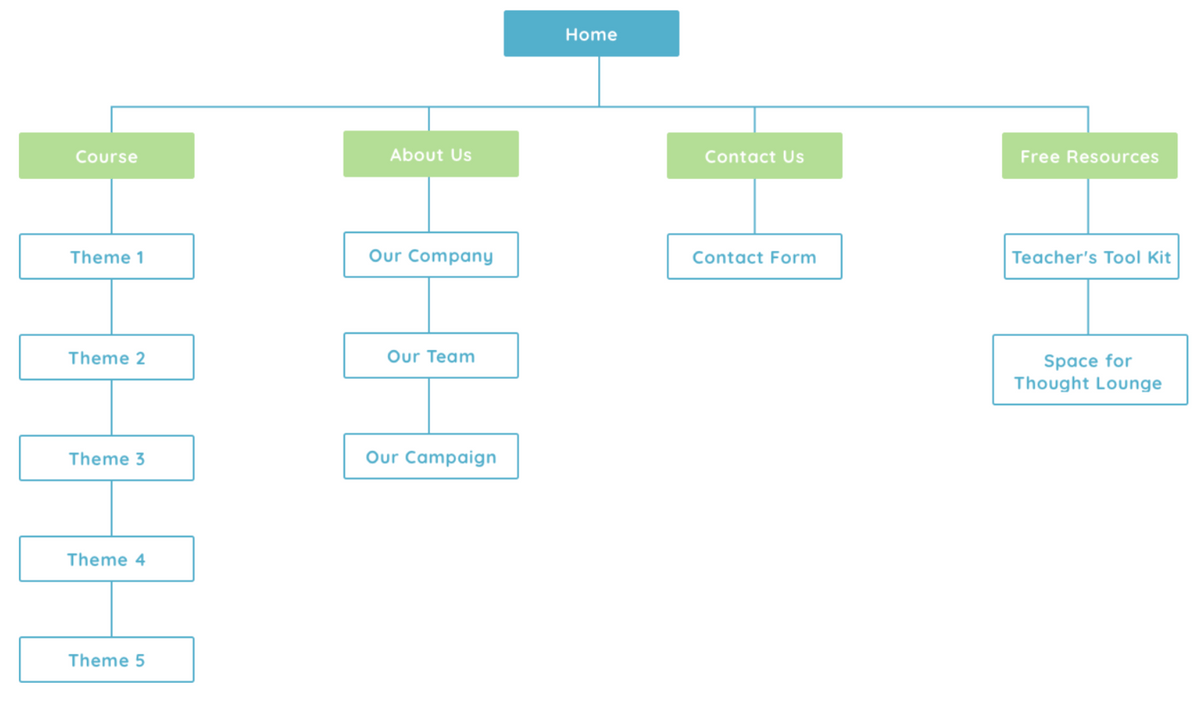
NEW SITEMAP
Based on our Content Audit & Cart Sorting, we were able to come up with a new Information Architecture that reduced the website to 3 layers of navigation only
Homepage
4 Subheaders
Content links.

DESIGN STUDIO
With so many ideas flying around it was challenging for us to decide what an ideal design should be, therefore we conducted a design studio exercise.
For this exercise, we were all given 5 minutes to sketch out what we envisioned the homepage to look like without talking to each other. At the end of it, we came together to discuss what we liked and disliked and agreed on an ideal design.

USER TESTING
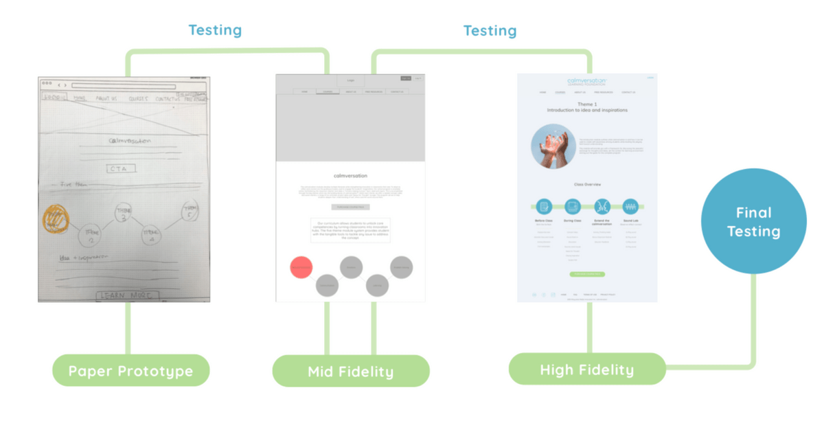
Between the different fidelity levels of our wireframes, user tests were conducted along the way so that we were able to keep on refining the website.

CHANGE #1: APPLYING CONSISTENCY TO TERMINOLOGY
Throughout our website we were inconsistent with our terminology.
Words like “Program”, “Bundles”, “Courses”, “Themes”, ”packages” were used interchangeably and it confused the users.
Therefore, we decided to change them all to “Courses” for consistency sake.


CHANGE #2: RE-DESIGNED CONTACT FORM TO A STEP-BY-STEP PROCESS
This is our Contact Us page. We at first started with a form that threw all the required fields at you at the same time, but we found through testing that a step by step process was more intuitive because users would feel less overwhelmed.
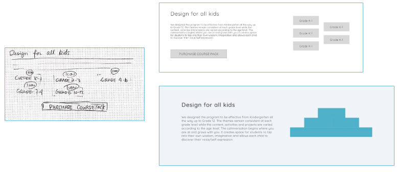
CHANGE #3: RE-DESIGNED VISUALS ON THE COURSES PAGE SO THAT THEY DO NOT LOOK LIKE BUTTONS
People also thought the graphics for grade levels on the "courses page” were buttons to click, so we changed it into a pyramid structure that beared little resemblance to buttons.
The image is meant to explain that the program is designed to be used for all age groups and grows with the children.


CHANGE#4: REMOVED CTA BUTTON ON COURSES PAGE TO AVOID CONFUSION
We also had two CTA (call to action) buttons that said “Purchase course” in the courses page on Mid-fi level. Users thought that they were meant for the purchase of two different items, therefore we removed the bottom one and kept the top one only for High-fi. We did not want to confuse users into thinking there was a separate course package for younger kids.
CHANGE #5: CLEAR VALUE PROPOSITION ON HOMEPAGE
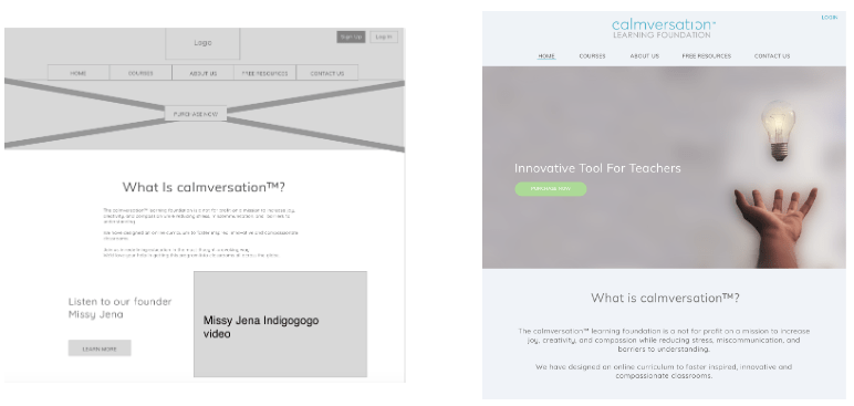
The biggest problem that we identified through testing was that users were still confused at what the site was promoting at the homepage. We made the value proposition big and obvious that it’s an “Innovative Tool for Teachers”


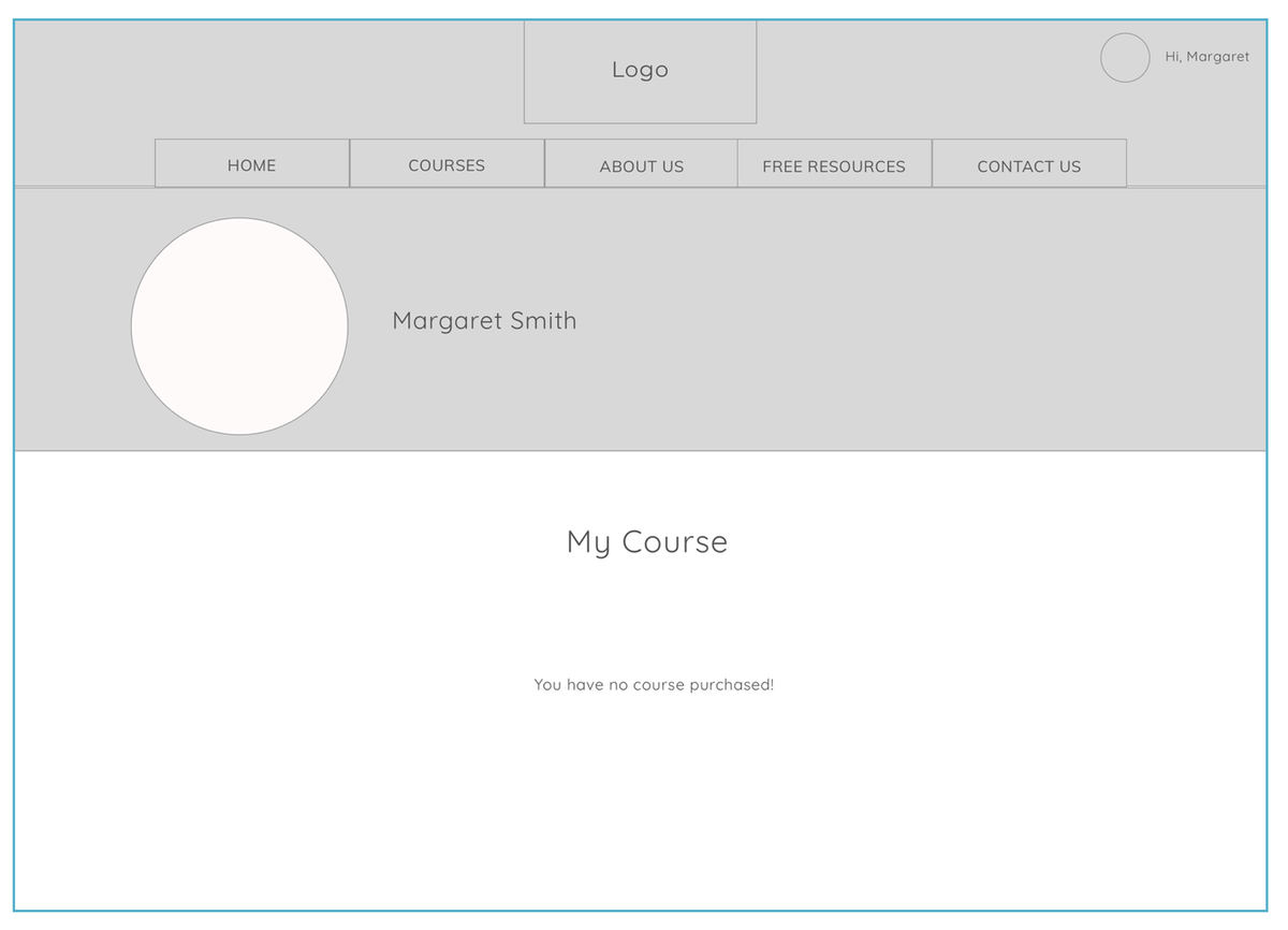
CHANGE #6: REMOVAL OF DASHBOARD
We originally had a dashboard where users can manage the courses they purchased, but we removed it to avoid confusion.
Currently, there is already a 3rd party site called Thinkific that is already being used for logging in and creating an account. The site is also where our client hosts her courses and allow others to purchase them.
We wanted to keep things simple and let the log-in button on our website redirect the user to Thinkific without any hassle. Previously, you had to dig deep on the old website for access after going through email confirmations.
RETROSPECTIVE
Overall, it was definitely a great experience and our client was over the moon with the final product and said it was everything she envisioned and more.
We realized that although we did a great job of rearranging and condensing content, there was still much room for improvement when it came to the actual written material presented. Therefore, we suggested to our client that she should consider hiring professional copy writers to help her as it would be outside our project scope with a 3 week timeline.
Ultimately, I’m very proud of what we were able to accomplish as a team and how our designs were used for development of the website (www.calmversation.org)

